 |
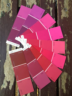
| Despite appearances, I'm not planning pink! |
For consistency in your brand identity – making sure your online content, business cards and in-shop decor match as far as possible - you will want to define your brand colours across a few of the standard colour systems.
It's quite fun and not too difficult to do to a basic level (if you want to take it quite seriously however, look here and here). It can reinforce your brand's message and helps you build a recognisable and trusted identity with your clients (good summary in that link), while also avoiding giving an unprofessional, slapdash impression by not having thought about it.
Where to start depends on where you will be using your branding the most, because the different colour systems create colour differently - for example by using light, or using ink - and not all colours are available across all systems. You probably don’t want to start in a paint shop, fun though that is. :)
If you’re mainly online, then start by looking at RGB and hexadecimal colour picking tools - use design software such as PhotoShop or one of the tools listed below. If printed material will be more important to your brand, then it’s probably best to start with CMYK, since most of your printing will probably be done using digital printers.
Many major brands choose specific Pantone colours for their branding. Pantone corporation developed this system of uniform colour definition and produce sample books of colours that are used by manufacturers, designers and brands to ensure their materials are precisely the same colour wherever they are produced. These colours are labeled with a PMS (Pantone Color Matching System) number, and approximations (or exact matches for some of the colours) in CMYK are given in some of their swatch books.
It can be handy to know your equivalent or closest approximate PMS number, in case you need to manufacture goods in your corporate colours, or to do large single-colour offset printing but in general, it appears that decisions on CMYK and RGB/Hexadecimal will be enough for a small business.
For a degree of consistency across various media, once you have your main brand colour defined in the most suitable colour system for your business, you can look up the closest matches in the other systems using conversion tools like those listed below.
Note that there are many more colours available online (RGB/hexadecimal) than can be created in ink, and so if you are starting with a web colour, it could be hard to get a perfect match. If possible, test print the CMYK version of your chosen brand colour before doing your first large print project.
Building outwards from your main official colour, you can also use colour theory to look up contrasting and complimentary colours and create a brand palate (try this color calculator tool).
Have a look at some brands' style guides to see how they do it. Note that large brands often go into tremendous detail (pdf) and include (pdf) direction regarding fonts, required space around logos etc. You probably won't need to be quite as extensive or strict as these examples, but preparing at least a basic style guide for colour sets you off in the right direction as your business grows.
Some useful tools to play around with:
http://www.sessions.edu/color-calculator - Cool little colour wheel you select or input your hexadecimal and get to see various workable colour combinations to go with it.
http://www.easyrgb.com/index.php?X=SEEK – Great tool converts CMYK or RBG (and other) colour systems to equivalents in well known paint ranges. Also helps look up complimentary colours and tells you the closest 'web safe' version of your chosen colour.
http://www.mypantone.info/ – An online Pantone colour chart (oxymoron?), click to see colour fill the browser window, also shows CMYK and hexadecimal values. This isn't an official Pantone site.
http://www.pantone.com/pages/pantone/category.aspx?ca=86 - Official Pantone apps, including one that looks up Pantone colours from CMYK/RGB. (Video of app)
http://www.benjaminmoore.com/en-us/for-your-home/color-gallery – No Pantone or CMYK values here but a fun colour gallery with images of rooms using your selected colour along with complimentary options if you want inspiration.

Hello, I found your blog a few days ago when I was looking for information on rent for small retail space in Tokyo. It's really encouraging to know there're other foreigners in town who are thinking about starting a small business/shop here. I found your posts really useful and inspiring. Although I'm not looking to open a bakery/cake shop, I probably will have to go through similar steps. Seeing how consistent you are in moving towards your goal really motivates me to try harder (and I do need a Lot of motivation!!!). Thank you for sharing your experience, tips and so on! Hope I will have a chance to stop by your shop in Azabu sometime in the near future! ^_^
ReplyDeleteHello there! Thank you so much for the kind comment. Indeed, we are many! It's always lovely to hear from people working on similar plans in Japan, and working through the various steps. It's a good challenge! Good luck and hope to see your work come to fruition soon too.
ReplyDelete